- Why Every AI-Built App Looks the Same
- Five Patterns of AI-Generated UI Design That Make Every Product Look the Same
- Why AI Tools Produce the Same UI Output Every Time
- Why Your App Looks Generic to Investors
- How to Fix Generic AI App Design Before the Build Starts
- Frequently Asked Questions About AI-Generated UI Design
- The Purple UI Problem Is Fixable Before the Build Starts
Why Every AI-Built App Looks the Same
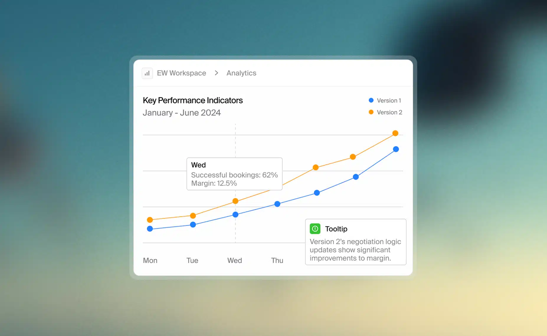
Founders using Lovable, Bolt, Base44, and Cursor are shipping products faster than anyone thought possible two years ago. They are also shipping products that look identical to each other. Why AI-built apps look the same is not a coincidence. These tools draw from the same component libraries, apply the same design token defaults, and produce the same interface patterns regardless of what the product actually does. Left rail. Rounded cards. Purple or blue accent. Generic sans-serif. The result is a generation of products that function correctly and are visually indistinguishable from every other AI-built product on the market.
This has a name. Designers call it the Purple UI Problem, because these tools default to purple accent colors when no brand color has been specified. The name stuck because the pattern is systematic, not accidental. At the technical level, it comes from shared component libraries and identical design token defaults applied across every build. Dripatch’s full approach to preventing it is at vibe coding.
Five Patterns of AI-Generated UI Design That Make Every Product Look the Same
Left-rail sidebar navigation. When a founder asks Lovable, Bolt, or Base44 to build a dashboard, the output places navigation on the left. This is not a design decision. It is the most common pattern in the training data, applied by default. The result is an interface that reads as generic software before the user has finished reading the product name.
Rounded card grids. AI-generated content areas arrive as rounded rectangles arranged in a grid. Same radius, same spacing, same shadow. The layout is clean. It is also the exact layout the user has already seen in the last three products they evaluated.
Purple or blue accent at high saturation. This is the pattern that gave the Purple UI Problem its name. When no brand color has been specified, these tools default to purple or blue at settings that read as vibrant in a component preview and indistinct in a market where half the competing products made the same choice.
Inter and its near-identical cousins. The default typeface across AI-generated interfaces is Inter, DM Sans, or a geometric sans-serif that differs from Inter by measurements a non-designer would not notice. Typography is the most direct carrier of brand character. Defaulting to Inter is the typographic equivalent of choosing no font at all.
Generic empty states and loading states. The screens a user sees most, before data loads and when a queue is empty, receive the least design attention in AI-built products. “No items yet” is a complete sentence. It is not a brand moment. Every tool ships these identically, because no tool applies judgment to what happens when the interface has nothing to show.
Why AI Tools Produce the Same UI Output Every Time
AI code generation tools are trained on existing UI patterns from across the web. The most common patterns dominate the training data, which means the most common patterns dominate the output. A left-rail sidebar appears on millions of dashboards. A rounded card grid appears on millions of content pages. An AI tool asked to build a dashboard will produce both, not because they are the right choice for this product, but because they are the statistically probable answer.
The component source compounds the problem. Most AI-generated interfaces are built from Shadcn, Radix, or Material UI components. These are well-built libraries. They are also recognizable on sight. When two competing products are both assembled from the same library without customization, they share a visual language their founders did not choose and cannot explain. The components arrive pre-configured with defaults: corner radius, shadow depth, spacing scale, interaction patterns. None of those defaults were chosen for any specific brand.
Design tokens are the values that define a product’s visual character: the specific hex code for the primary color, the font size scale, the spacing increments, the border radius applied to every element. These are the decisions that make one product look like Stripe and another look like every other SaaS dashboard. AI tools do not change design token defaults. They apply the same values across every build because changing them requires design judgment. Nielsen Norman Group has documented that AI systems produce generic-looking interface outputs when left to make visual design decisions without human judgment. The tools are not making poor choices. They are making default choices, which is a different problem entirely and one that tools are not built to solve.
Why Your App Looks Generic to Investors
Investors evaluate products visually before they evaluate functionally. This is not a superficial bias. It is a signal-processing shortcut that applies whether the evaluator is a partner at a seed fund or an angel writing their first check. A product that looks like every other AI-built SaaS MVP is processed as a generic product before the founder has said a word. The pitch has already started before the demo, and in a room where the deck goes up on a screen, visual quality is the entire first impression for approximately seven seconds.
Consider two SaaS founders at the same stage, same market, same core problem to solve. One ships their MVP with AI defaults intact: the left-rail nav, the rounded cards, Inter at medium weight, purple accent. The other spends two weeks in Figma before the build starts, defines a minimal design token set, customises the component library, and ships with a visual identity that reads as deliberate. Both products have the same feature set on launch day. One raises a follow-on round. The other does not get a second meeting. The difference is not functionality. It is whether the product looks like the founder thought about it.
The Purple UI Problem is not a cosmetic concern. A product that looks templated signals that the thinking behind it is also templated. That perception is not corrected by a better pitch. Vibe coding design quality is the variable most founders underestimate and most investors notice first, because they have sat through enough pitches to recognize a default purple sidebar the moment it appears on the screen.
How to Fix Generic AI App Design Before the Build Starts
The Purple UI Problem is preventable. It is not fixed after the product ships. It is fixed before the build starts, in the decisions made before any component library is opened. Five steps separate a product with a visual identity from a product that looks like every other AI-built SaaS on the market.
1. Define a visual identity before choosing a component library. Brand color, primary typeface, and spacing scale must be decided before any tool is opened. These three decisions constrain every component that follows. Without them, the component library makes the decisions by default, and the default is always generic.
2. Build a minimal design system in Figma before writing code. Not a full design system. A design token set: color palette, typography scale, border radius, shadow depth. Four decisions that take a day and determine the visual character of the entire product. Figma before code is the rule. Every build that reverses that order produces the Purple UI Problem.
3. Customise the component library before using it. Shadcn is a strong foundation. The problem is shipping it without modification. Override the default radius. Set the primary color. Adjust the shadow. These are not cosmetic changes. They are the difference between a product that reads as a Shadcn project and one that reads as a product.
4. Design at least three screens before building any. The dashboard, the onboarding flow, and the core workflow screen. These three decisions establish the visual language for the entire product. Every subsequent screen inherits from them. Designing three screens in Figma before the build starts is not additional work. It is the work that prevents rebuilding everything six months later.
5. Apply design judgment to empty states, loading states, and error states. These are the screens users see most often in the first weeks of using a product and the screens AI tools handle worst. A designed empty state is a brand moment. A default empty state is a sign that nobody thought about the user after the happy path was built.
Dripatch applies all five before a single component is generated. Every MVP Build project starts in Figma. The design token set is built, the key screens are designed, and the component library is customised before the AI tools start generating code. The full build service is at MVP Build. For fixed-cost pricing across both tracks, see MVP Build pricing. Portfolio work is at work.
Frequently Asked Questions About AI-Generated UI Design
The Purple UI Problem Is Fixable Before the Build Starts
What separates a product that looks fundable from one that does not is not budget. It is sequence. The founders who ship products that read as deliberate made design decisions before the build started. They defined a visual identity, built a minimal token set, and designed the key screens before a single component was generated. The founders whose products look like every other AI-built SaaS on the market skipped that step, not because they did not care, but because no one told them the tools would not do it for them.
Dripatch builds design-first. Every MVP Build project starts in Figma, not in a component library. The design token set is defined, the key screens are designed, and the component library is customised before the AI tools generate a line of code. The product that ships looks like the brand that built it, not like the tool that assembled it. Further reading on what this means for AI-accelerated development is at what is vibe coding. The full build service is at MVP Build.